Two phoenixes – the logo – the journey – the symbolism
An ideal logo immediately reveals what it’s all about.
Maybe not all, but at least whether it’s a company logo – and oftentimes you can even guess what they do based on the logo. In our case we wanted it to say: “Music and magic”.
But there’s a lot of different musical genres out there… and guess what, depending on the music you do these logos vary like night and day. I grew up listening to female singers like Celine Dion and Mariah Carey. They usually just go for typography using their own name, and nothing too eye-catching. Just simple elegance, really. So, this was my first approach – and one we’ve tried since we started making music back in 2003, then for Enchanted Duo too when we started our band in 2007.
Feeling the need to really brand ourselves in 2021, I contacted SantaGrinina, who specialises in sacred geometry and mystical logo design. (This after browsing logo designers on Fiverr for days and weeks… It takes time to find someone with a style that really appeals… What feels right.) SantaGrinina accepted this challenge, and we were on. She started out sending me three rough sketches to choose from.
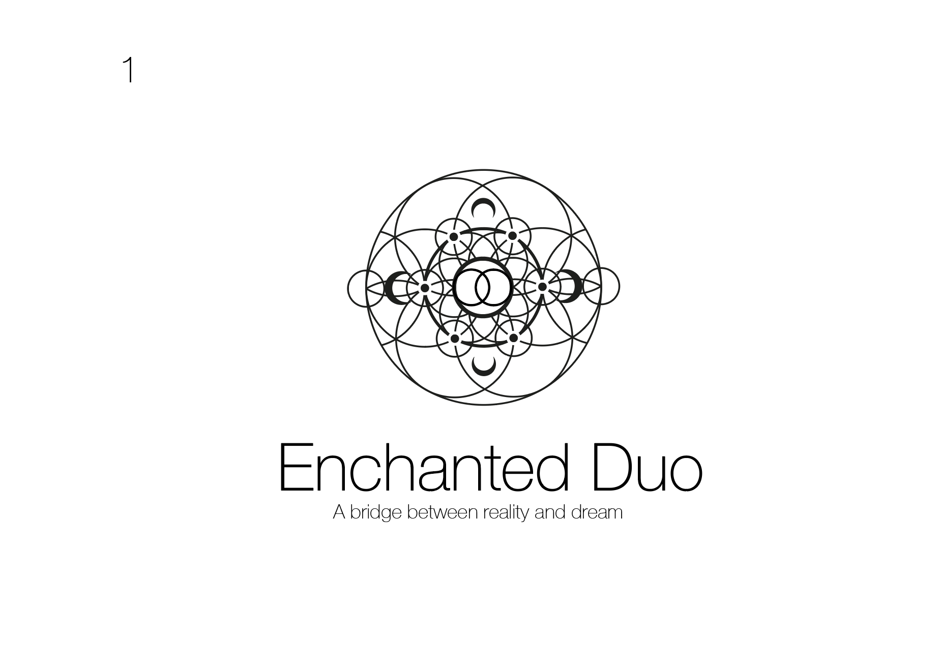
1. A cosmic approach to the seed of life, almost like an eye. The overlapping circles at the centre symbolises the sacred duo. Universally known for unity, creation and new beginings.
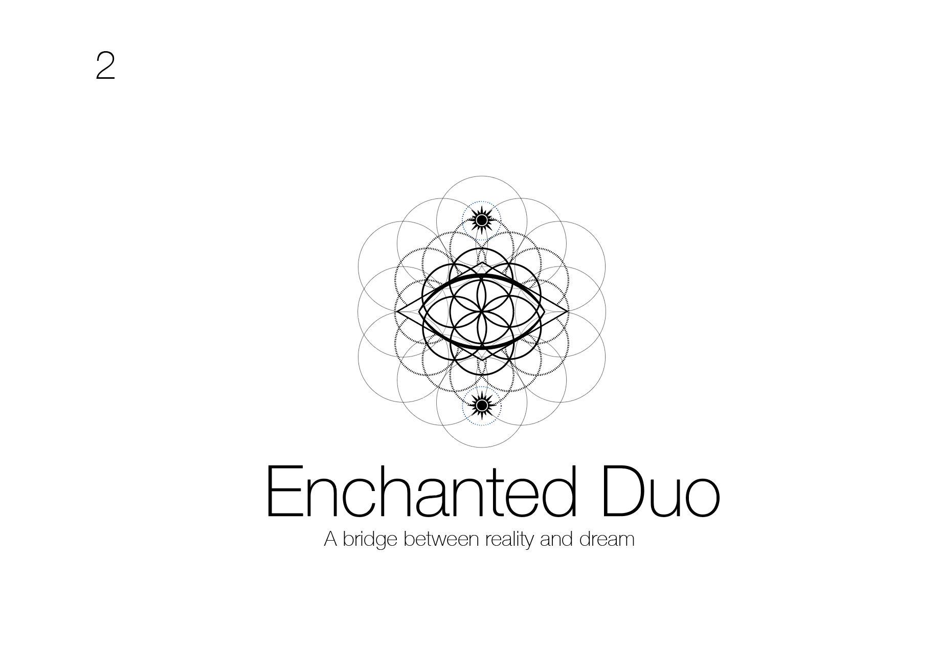
2. Another version of the eye, and a variation of the flower of life, almost like an auric field. The two black stars/suns symbolise the dualism and mysticism. The dimond shape represents the four directions and the presense of the spirits of the four directions.
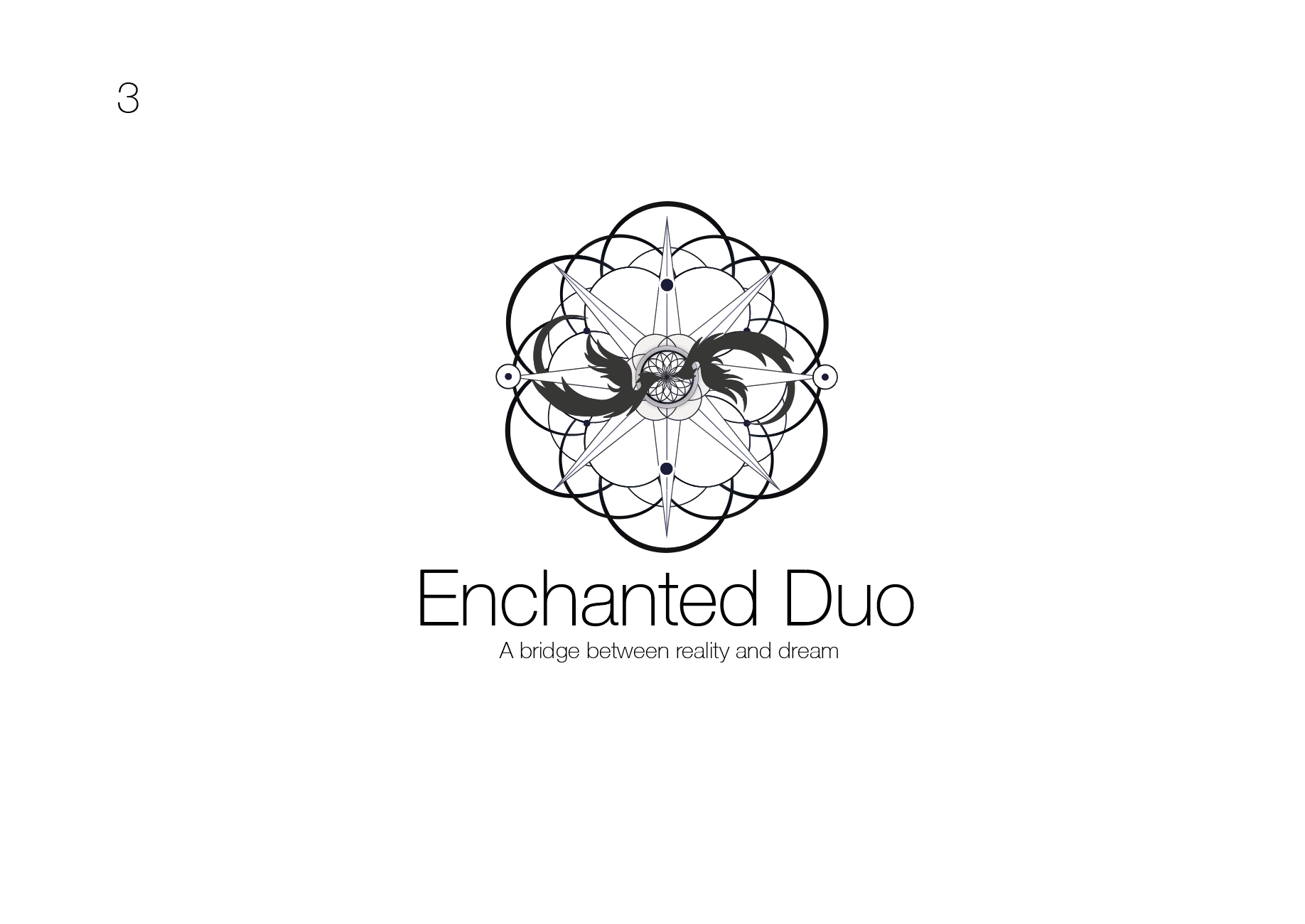
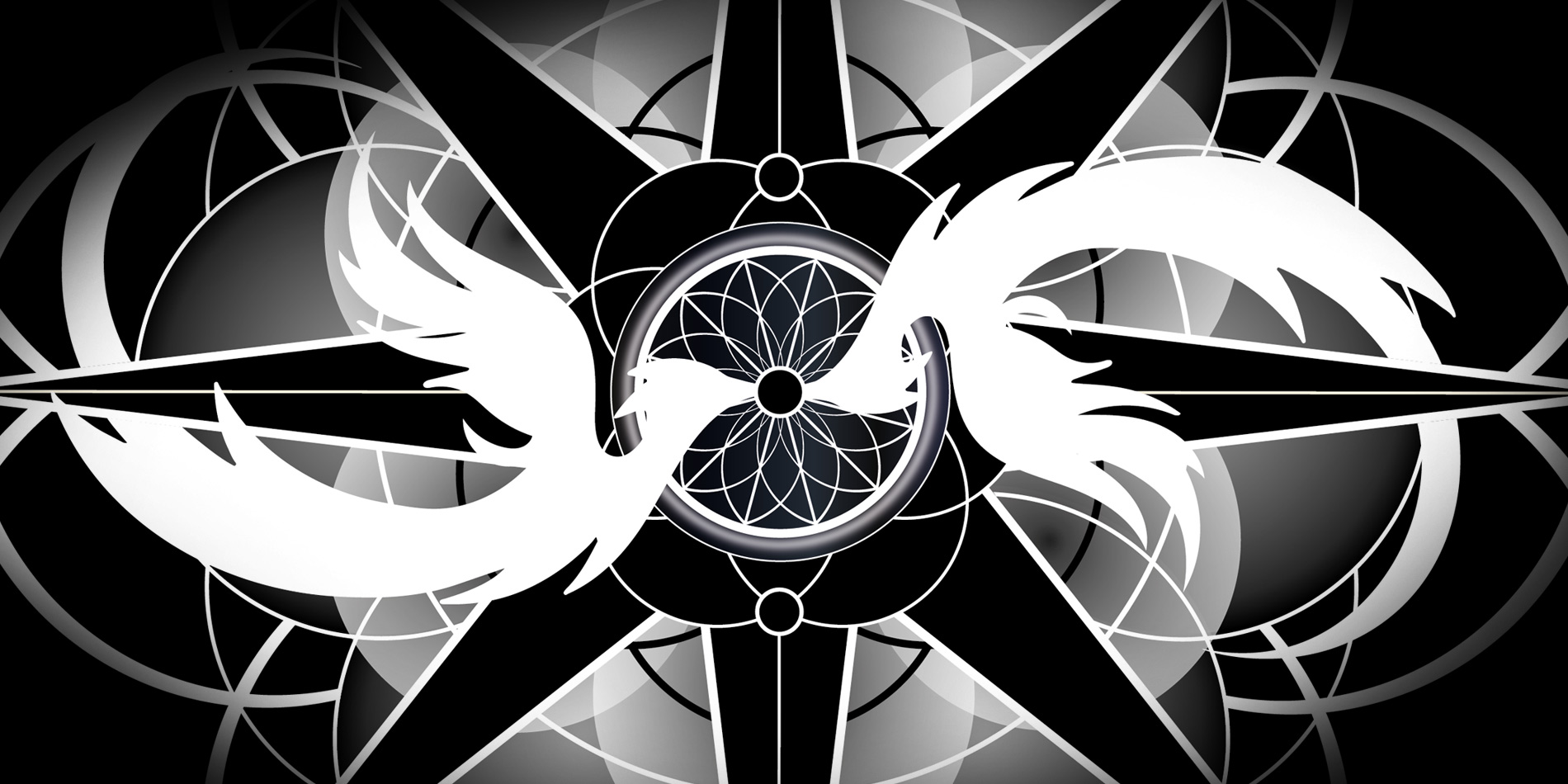
3. The duo is represented by two phoenixes symbolising the a rebirth, from the centre where the phoenixes kiss sacred patterns evolve. The seed of life again representing creation and new beinnings, especially since we felt we’d finally found a new sound we liked and this was like a rebirth for Enchanted Duo. The 8-pointed star is a powerful symbol for recreation and guidance in mysticism and spirituality.
Well, you already know which one we chose. It was a no-brainer.
They’re all beautiful, but the phoenixes just had that something extra.
Then the work began to refine the logo design. To choose colours, make sure every detail is thought through. It takes time and presence – but mostly the heart just knows. Working with SantaGrinina was a true pleasure – such patience and care – and perfectionism. (One perfectionist to another, it’s wonderful to work with someone who gets the details – of course given that these details are important.)

We wanted a logo that would work on both white and black background, which in the end resulted in two colour variations. No 2 and no 6 above.
All of them are beautiful, but these two just stood out to us.
SantaGrinina completed these two (no 2 and no 6) with final adjustments – and note how the typography was still kept simple. (Like for the role models I’d had growing up listening too, and of course admired their cover arts for too many hours to count…)
It’s such beautiful logo, but it doesn’t necessarily scream music. This realisation was something I had to grow into. Meanwhile, we used this logo for a year or two, and I just had this feeling that it wasn’t right just yet.
While pondering the logo, we dove into the phoenix theme and my book Little bird lost was born to further underline the phoenix symbolism.
It was also the fact that we were recording more songs for our album, some of them with heavier rock sounds and metal influences. I started looking at typography and logos in this genre instead, and realised we needed to do something.
I wasn’t sure what to expect exactly… I found BlaqkDesign, also on Fiverr. I told him I love the logo, but not the typography and that both needed to be made a little rockier. And so, our rock logo was born.
So finally, our logo says: “Music and magic”, perhaps even “progressive rock and magic”. Along with a touch of fantasy, and folklore.
The lesson in all this, something for you too to remember in all your wonderful endeavours, is that you can’t have everything figured out from the start. But the moment you take one step forward the Universe is eager to show you the next.
And does this conclude our logo journey? Naah, I doubt it. I even had to do a variation for our web page – if you’ve thought about it 😉.
Nothing but love and phoenixes,
Anneli
